1. Use a visually appealing color palate

Avoid at all costs
Choose fonts and background colors that compliment each other. You want your users to enjoy your color scheme without it being distracting or overly exaggerated. If you want to see how colors can work together, check out Adobe Kuler.
2. Take advantage of your header
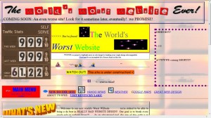
Include your most critical information at the top of your page. WARNING: Don’t overcrowd your header, be picky when you choose which information to add. Ask yourself, “Will this give my viewer a sense of who I am and what I represent? Does this help enforce my brand? Is this distracting or attracting to my website?”
3. Search Engine Optimization is essential
Even Fry can tell when you’re desperate.
If you want to be seen, you have to be found. If your website is about travel, use the word “travel” in the title and in the URL. Put important words in the headers of your posts, but make sure it sounds fluid. If you are writing about your last trip to Italy, say “Stories from my travels to Italy”, not “Europe Italy Travel Stories Rome”. Sure, the second option would help you get found, but you look desperate and your users will be able to tell. SEO is such an important topic that we can’t fully cover everything, but you can read some great advice from our friends over at quicksprout.com
4. Find your niche

Sometimes it’s okay to exclude people from your website. Don’t try to please everyone with everything!
There are so many fascinating things in the world, but try not to include all of them on your website. If you are known for writing about cars, stick to cars. If you always produce high-quality portraits, talk about photography. It’s all about consistency, not information overload – you wouldn’t expect to go to hotels.com to read about the news in China, keep the same standards for your website.
5. White space isn’t wasted space
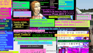
I need an Ibuprofen or three for the headache this is giving me.
Too many people try to make their website as interesting as possible and include as much information as they can. Your website should be a stream of information, not an explosion of images, videos, colors, and words. People need time to think about what they have seen and read, and white space gives the appropriate room to give your eyes a break from taking in so much information.
0 comments… add one